table是作为数据展示重要的一项,最近的需求是需要做一个系统的菜单配置,菜单可能有多级,设计稿要求是多级菜单可以以树状图展开。
本篇前后使用了两种方法,记录一下踩坑。
方法一:expand
给el-table-column设置属性 type=”expand” 可以自定义展开,实现table内嵌table的效果。
我的设计思路是展开的column也设置同样的属性,那不就可以共享列了嘛~
还有一个问题就是slot中展开的table列可能会和父级table列对不齐,于是我给子集设计了一个空列,长度加起来和父级table列宽度相同,初看非常完美,代码如下:
1
2
3
4
5
6
7
8
9
10
11
12
13
14
15
16
17
18
19
20
21
22
23
24
25
26
27
28
29
30
31
32
33
34
35
36
37
38
39
40
41
42
43
44
45
46
| <el-table
:data="sysList"
:row-key="getRowKeys"
:expand-row-keys="expands"
@expand-change="toggleRowExpansion"
>
<el-table-column fixed type="expand">
<template #default="plcs">
<el-table
class="plcsTable"
:data="plcs.row.children"
:row-key="getRowKeys"
:show-header="false"
:expand-row-keys="childExpands"
@expand-change="childRowExpansion"
>
<el-table-column fixed width="40"></el-table-column>
<el-table-column fixed type="expand">
<template #default="sys">
<el-table
:data="sys.row.btn"
:row-key="getRowKeys"
:show-header="false"
:expand-row-keys="childExpands"
@expand-change="childRowExpansion"
>
<el-table-column fixed width="120"></el-table-column>
<el-table-column
fixed
label="菜单名称"
prop="name"
width="148"
></el-table-column>
</el-table>
</template>
</el-table-column>
<el-table-column fixed label="菜单名称" prop="name" width="180"></el-table-column>
</el-table>
</template>
</el-table-column>
<el-table-column fixed label="菜单名称" prop="name" width="220"></el-table-column>
</el-table>
|
还需要设置 row-key ,保证每列不同,这样展开收起时不会产生冲突。expand-change 是每次展开操作时调用的方法,这里主要是控制自身状态改变,以及父级展开自身时将子级收起,实现手风琴效果。
1
2
3
4
5
6
7
8
9
10
11
12
13
14
15
16
17
18
19
20
21
22
23
24
25
26
27
| const expands = ref([])
const childExpands = ref([])
const toggleRowExpansion = (row) => {
childExpands.value = []
toggleExpansion('expands', row)
console.log(expands.value, childExpands.value)
}
const childRowExpansion = (row) => {
toggleExpansion('childExpands', row)
console.log(expands.value, childExpands.value)
}
const toggleExpansion = (Expands, row) => {
let [expandsNum] = [Expands]
console.log('expandsNum=', expandsNum, 'toggleExpansion', Expands, 'row.id=', row.id)
if (expandsNum == row.id) {
;[Expands] = []
return false
}
;[Expands] = []
;[Expands].push(row.id)
}
const getRowKeys = (row) => {
return row.id
}
|
由于本项目中列数较多,产品要求序号列、name列和操作列固定,对用户更友好。于是我给这些列设置了属性 fixed ,结果,新问题来了,子集展开table无法固定了!如下图所示:
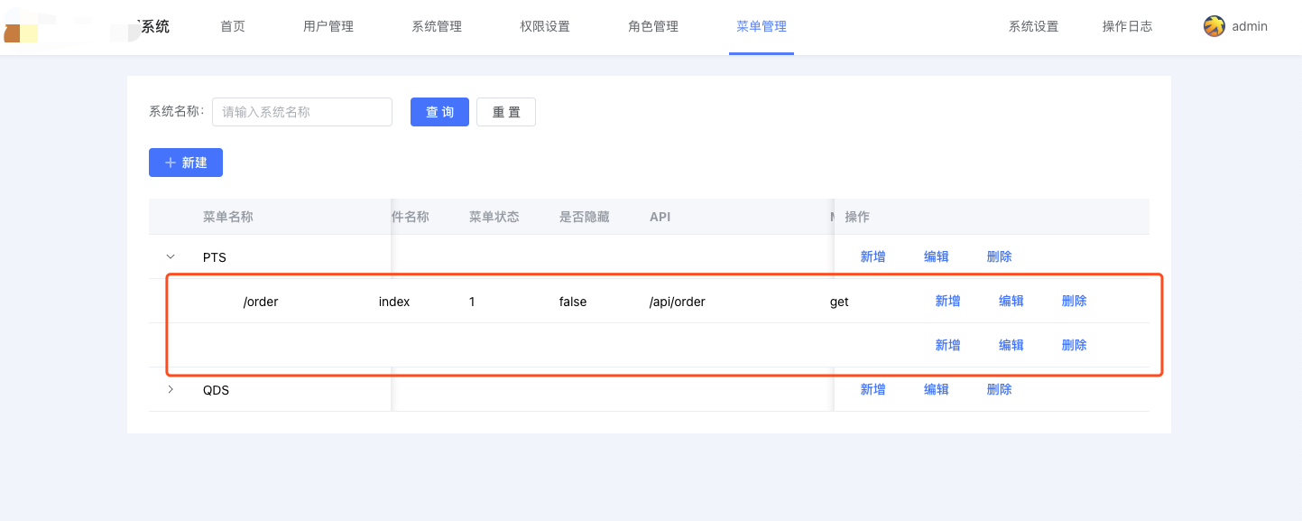
我想了半天是不是还需要手动给 slot 中的table设置样式呢?这样也太麻烦了吧。。。
方法二:tree-props
再次查阅资料,发现了 tree-props 这个属性,设置 tree-props 为{children: ‘children’,hasChildren: ‘hasChildren’} ,data 绑定的数据需要保留 children 属性,当 row 中包含 children 字段时,被视为树形数据。渲染树形数据时,必须要指定 row-key(绑定数据的唯一值变量id);
支持子节点数据异步加载;
注意:如果不是懒加载的话,不要设置 hasChildren 这个属性,要不然树形无法显示;如果是懒加载,则需要设置hasChildren字段。
尝试代码如下:
1
2
3
4
5
6
7
8
9
10
11
12
13
14
15
| <el-table
:data="sysList"
:row-key="getRowKeys"
class="table-expand"
:tree-props="{ children: 'children', hasChildren: 'hasChildren' }"
>
<el-table-column fixed> </el-table-column>
<el-table-column fixed label="菜单名称" prop="name" width="220"></el-table-column>
<el-table-column fixed="right" label="操作" width="350">
<template #default="scope">
<el-button type="text" @click="openEdit(scope.$index, scope.row)">编辑</el-button>
</el-table-column>
</el-table>
|
哦豁,居然完美实现了固定列和下拉展开!只是展开会有状态的延续性,点击下一级无法实现手风琴效果。
网上说添加:expand-row-keys="expands" @expand-change="expandSelect"可以控制展开,但是我添加之后发现连原始的小箭头都无法点击了,遂放弃。
在 fixed 和手风琴效果里面 trade-off,还是 fixed 更重要吧~
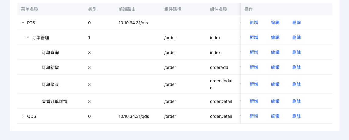
进一步优化-按照层级对齐
展开多级以后,发现各层级之间查看较为眼花,最好能用缩进来展示层级,这里我设计了动态 style ,按照层级加一个 padding ,轻松搞定~
1
2
3
4
5
6
7
| <el-table-column fixed label="菜单名称" prop="name" width="220">
<template #default="scope">
<span :style="{ 'padding-left': (scope.row.level - 1) * 8 + 'px' }">{{
scope.row.name
}}</span>
</template>
</el-table-column>
|
附录
element-ui table expand 展开树形菜单手风琴效果