el-table 表格长度自适应是交互优化中很重要的一环,本次做了很多尝试,记录一下写法和出现的问题。
问题描述
当前给表格固定了列宽,前后分别设定了部分固定栏(例如:左侧的序号列,右侧的操作列),container 不设置 width,只有一个 min-width,保证页面缩小时内容依然保持一定样式不重叠,页面拉长时表格可以跟随拉长,直至平铺。
这对于长表格(列数多)来说没有问题,但对于短表格(列数少),会出现右侧空白,影响整体美观。
修改方案:按照 width * 系数 计算实时列宽
计划采用百分比布局,使其自适应,尝试后发现 el-table-column 并不能识别。所以尝试手动修改比例系数。
| <el-table-column
prop="create_by_name"
label="创建人"
:width="100 * scaleRate"
show-overflow-tooltip
></el-table-column>
|
页面初始化时做一次计算,挂载定时器,页面销毁时,卸载定时器。
| onMounted(() => {
calcRate()
windowDraw()
})
onUnmounted(() => {
loadingTable.value = false
unWindowDraw()
})
|
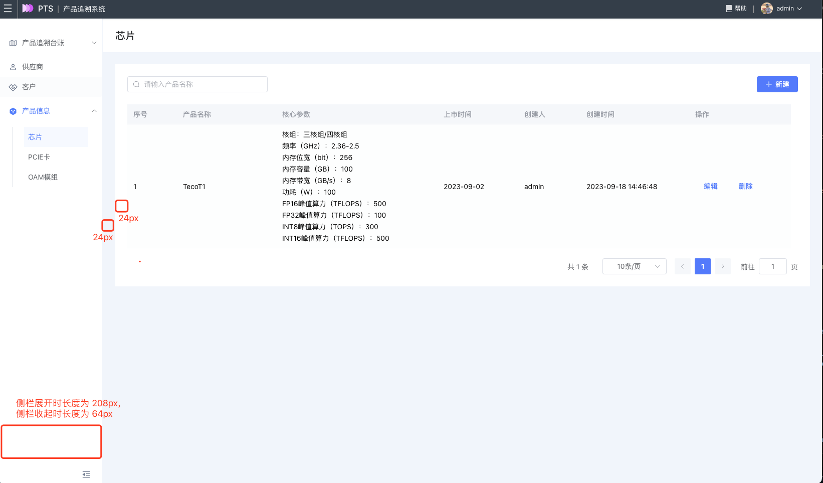
计算系数如下,其中 totalWidth 为列宽的长度总和,64px 为侧栏收起时
1
2
3
4
5
6
7
8
9
10
11
12
13
14
15
16
17
18
19
20
21
22
23
24
25
26
27
28
29
30
31
32
33
34
| const totalWidth = 1000
const windowDraw = () => {
window.addEventListener('resize', resize)
}
const unWindowDraw = () => {
window.removeEventListener('resize', resize)
}
const timer = ref(0)
const resize = () => {
clearTimeout(timer.value)
timer.value = window.setTimeout(() => {
calcRate()
}, 200)
}
const calcRate = () => {
const innerWidth = window.innerWidth
const sidebar = appStore.getSidebar
const isCollapse = !sidebar.opened
let currentWidth
if (isCollapse) {
currentWidth = innerWidth - 64 - 96
} else {
currentWidth = innerWidth - 208 - 96
}
if (currentWidth >= totalWidth) {
const rate = currentWidth / totalWidth + ''
state.scaleRate = Number(rate.substring(0, rate.indexOf('.') + 3))
}
}
|
最终效果如下:
基本满足需求,但是因为 js 计算不是很精确,部分表格右侧出现一点空隙,container 的两侧 padding 肉眼可见不一样。
修改方案:设置 min-width
思路是放开所有列宽,使其天然自适应,但是发现部分列的比例分配不对,文字容易折行,最好是还是能按照现有比例进行分配。
查阅资料后发现有 min-width 这个属性,并且需要所有列宽都设置 min-width,能实现表格拉长时自适应。
列宽规则总结
- el-table-column 不设置 width 与 minwidth,每一列自适应,宽度一致
- el-table-column 设置 width=30%,无效。会被当成 width=30px
- 每一列都设置 min-width 才能实现每一列的百分比配置
- .el-table-column 同时设置 min-width 和 width 后,该列表格就会按照 width 来设置,相当于 width 就是一个最大宽度